| n | sum | mean |
|---|---|---|
| 8 | 8440 | 1055 |
1 Data Summary and Presentation
NoteMajor Themes of Chapter 2
Descriptive Statistics: Learn to compute and interpret measures of central tendency (mean, median) and variability (variance, standard deviation, range)
Data Visualization: Master key graphical displays including histograms, box plots, stem-and-leaf diagrams, and scatter plots
Distribution Analysis: Understand how to assess the shape, center, spread, and outliers in datasets
Time Series Patterns: Recognize trends, cycles, and other temporal patterns in engineering data
Multivariate Relationships: Explore relationships between multiple variables using correlation analysis and scatter plot matrices
Quality Tools: Apply Pareto charts and other specialized plots for engineering problem-solving
ImportantLearning Objectives
After careful study of this chapter, you should be able to do the following:
Compute and interpret the sample mean, sample variance, sample standard deviation, sample median, and sample range.
Explain the concepts of sample mean, sample variance, population mean, and population variance.
Construct and interpret visual data displays, including the stem-and-leaf display, the histogram, and the box plot and understand how these graphical techniques are useful in uncovering and summarizing patterns in data.
Explain how to use box plots and other data displays to visually compare two or more samples of data.
Know how to use simple time series plots to visually display the important features of time-oriented data.
Construct scatter plots and compute and interpret a sample correlation coefficient.
1.1 Data Summary and Display
1.1.1 Mean
Sample Mean
NoteSample Mean
If the n observations in a sample are denoted by X_{1},X_{2},\ldots,X_{n}, the sample mean is
\begin{aligned} \overline{X} & = \frac{X_{1} + X_{2} + \cdots + X_{n}}{n} \\ \overline{X} & = \frac{\sum_{i=1}^{n} X_{i}}{n} \end{aligned}
Population Mean
NotePopulation Mean
When there is a finite number of observations (say, N) in the population, the population mean is
\begin{aligned} \mu & = \frac{\sum_{i=1}^{N} X_{i}}{N} \end{aligned}
The sample mean, \overline{X}, is a reasonable estimate of the population mean, \mu.
Example
NoteExample: O-Ring Tensile Strength
Engineering Context: This example demonstrates how the sample mean serves as a measure of central tendency in materials testing. Understanding tensile strength is crucial for ensuring component reliability in aerospace applications.
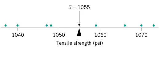
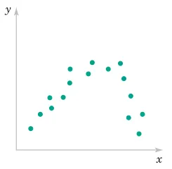
Consider the O-ring tensile strength experiment described in Chapter 1. The data from the modified rubber compound (1048, 1059, 1047, 1066, 1040, 1070, 1037, 1073) are shown in the dot diagram (Figure 1 and Figure 2).
Manual Calculation: The sample mean strength (psi) for the eight observations is:
\begin{aligned} \overline{X} & = \frac{\sum_{i=1}^{n} X_{i}}{n} \\ \overline{X} & = \frac{1037 + 1047 + \cdots + 1073}{8} \\ \overline{X} & = \frac{8440}{8} = 1055 \text{ psi} \end{aligned}
Physical Interpretation: The sample mean \overline{X} = 1055 can be thought of as a “balance point.” If each observation represents 1 pound of mass placed at the point on the x-axis, a fulcrum located at \overline{X} would exactly balance this system of weights.
Engineering Significance: This mean value provides a single representative measure that engineers can use to compare different rubber compounds or assess whether the material meets specifications.
# Load required libraries
library(fastverse)
library(kit)
library(data.table)
library(ggplot2)
library(scales)
library(kableExtra)
library(car)
library(GGally)

# O-ring tensile strength example
tensile_data <-
  data.table(TS = c(1048, 1059, 1047, 1066, 1040, 1070, 1037, 1073))

tensile_data_summary1 <-
  tensile_data %>%
  fsummarise(
    n = fnobs(TS),
    sum = fsum(TS),
    mean = fmean(TS)
  )

tensile_data_summary1 %>%
  kbl(caption = "O-Ring Tensile Strength Statistics", digits = 2) %>%
  kable_styling(bootstrap_options = c("striped", "hover"))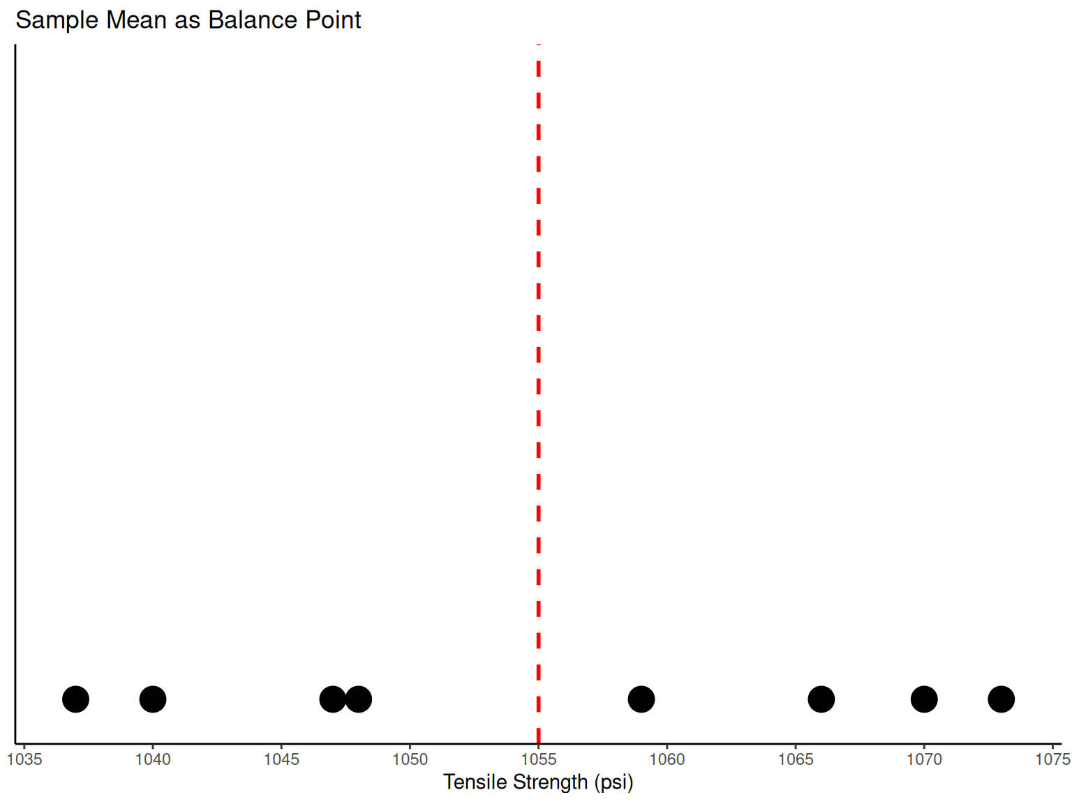
# Dot diagram showing sample mean as balance point
ggplot(data = tensile_data, mapping = aes(x = TS)) +
  geom_dotplot(binwidth = 1, stackdir = "up", dotsize = 1) +
  geom_vline(aes(xintercept = fmean(TS)), color = "red", linetype = "dashed", linewidth = 1) +
  scale_x_continuous(breaks = pretty_breaks(n = 8)) +
  labs(x = "Tensile Strength (psi)", y = NULL, title = "Sample Mean as Balance Point") +
  theme_classic() +
  theme(axis.ticks.y = element_blank(), axis.text.y = element_blank())
1.1.2 Variance and Standard Deviation
Sample Variance and Sample Standard Deviation
NoteSample Variance and Sample Standard Deviation
If the n observations in a sample are denoted by X_{1},X_{2},\ldots,X_{n}, then the sample variance is
\begin{aligned} S^2 & = \frac{\sum_{i=1}^{n}\left(X_{i}-\overline{X}\right)^{2}}{n-1} \end{aligned}
The sample standard deviation, S, is the positive square root of the sample variance.
Engineering Perspective: The units of measurement for the sample variance are the square of the original units. Thus, if X is measured in psi, the variance units are (\text{psi})^2. The standard deviation has the desirable property of measuring variability in the original units (psi), making it more interpretable for engineers.
Example
NoteExample: Variability in O-Ring Strength
Why Variability Matters: In engineering applications, understanding variability is often more critical than knowing the average. High variability can indicate process instability, quality issues, or the need for tighter manufacturing controls.
The numerator of S^2 is (See Table 1): \sum_{i=1}^{n}\left(X_{i}-\overline{X}\right)^{2} = 1348
Sample Variance Calculation:
\begin{aligned} S^2 & = \frac{\sum_{i=1}^{n}\left(X_{i}-\overline{X}\right)^{2}}{n-1} = \frac{1348}{8-1} = 192.57 \text{ psi}^2 \end{aligned}
Sample Standard Deviation:
\begin{aligned} S & = \sqrt{192.57} = 13.9 \text{ psi} \end{aligned}
Engineering Interpretation: A standard deviation of 13.9 psi means that most O-ring tensile strengths fall within about 14 psi of the mean (1055 psi). This gives engineers insight into the consistency of the manufacturing process.
Computational Note: \sum_{i=1}^{n}\left(X_{i}-\overline{X}\right)^{2}=\sum_{i=1}^{n}X_{i}^{2}-\frac{\left(\sum_{i=1}^{n}X_{i}\right)^{2}}{n} (computational formula).
| i | Xi | Xi - X̄ | (Xi - X̄)² |
|---|---|---|---|
| 1 | 1048 | -7 | 49 |
| 2 | 1059 | 4 | 16 |
| 3 | 1047 | -8 | 64 |
| 4 | 1066 | 11 | 121 |
| 5 | 1040 | -15 | 225 |
| 6 | 1070 | 15 | 225 |
| 7 | 1037 | -18 | 324 |
| 8 | 1073 | 18 | 324 |
| Total | 8440 | 0 | 1348 |
How Does the Sample Variance Measure Variability?
NoteUnderstanding Variability Measurement
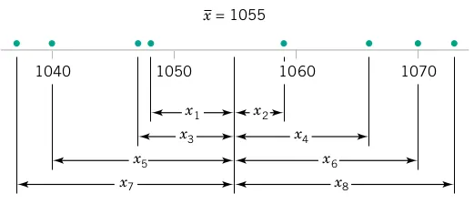
Engineering Insight: To see how the sample variance measures dispersion or variability, refer to Figure 3, which shows the deviations X_{i}-\overline{X} for the O-ring tensile strength data.
Key Concepts:
Greater variability → larger absolute deviations from the mean
Deviations X_{i}-\overline{X} always sum to zero
Squaring eliminates negative values and emphasizes larger deviations
Small S^2 indicates consistent process; large S^2 suggests high variability
Process Control Implications: Engineers use variance to monitor process stability. Increasing variance over time may signal equipment wear, material inconsistencies, or environmental factors affecting production.
Population Variance
NotePopulation Variance
When the population is finite and consists of N values, we may define the population variance as
\begin{aligned} \sigma^2 & = \frac{\sum_{i=1}^{N}\left(X_{i}-\mu\right)^{2}}{N} \end{aligned}
The sample variance, S^2, is a reasonable estimate of the population variance, \sigma^2.
1.2 Stem-and-Leaf Diagram
NoteStem-and-Leaf Diagram
Engineering Application: Stem-and-leaf diagrams are particularly useful for initial data exploration in engineering. They preserve actual data values while showing distribution shape, making them ideal for quality control and process analysis.
A stem-and-leaf diagram provides an informative visual display of a data set X_{1},X_{2},\ldots,X_{n}, where each number X_{i} consists of at least two digits.
TipSteps for Constructing a Stem-and-Leaf Diagram
Divide each number X_{i} into two parts: a stem (leading digits) and a leaf (remaining digit)
List the stem values in a vertical column
Record the leaf for each observation beside its stem
Write the units for stems and leaves on the display
1.2.1 Example
NoteExample: Aluminum-Lithium Alloy Compressive Strength
Engineering Context: This example analyzes compressive strength data from 80 aluminum-lithium alloy specimens. Such analysis is crucial for aerospace applications where weight reduction and strength are both critical.
Data Overview: The compressive strength measurements (in psi) from Table 2 represent quality control testing of a lightweight alloy used in aircraft components.
| 105 | 221 | 183 | 186 | 121 | 181 | 180 | 143 |
| 97 | 154 | 153 | 174 | 120 | 168 | 167 | 141 |
| 245 | 228 | 174 | 199 | 181 | 158 | 176 | 110 |
| 163 | 131 | 154 | 115 | 160 | 208 | 158 | 133 |
| 207 | 180 | 190 | 193 | 194 | 133 | 156 | 123 |
| 134 | 178 | 76 | 167 | 184 | 135 | 229 | 146 |
| 218 | 157 | 101 | 171 | 165 | 172 | 158 | 169 |
| 199 | 151 | 142 | 163 | 145 | 171 | 148 | 158 |
| 160 | 175 | 149 | 87 | 160 | 237 | 150 | 135 |
| 196 | 201 | 200 | 176 | 150 | 170 | 118 | 149 |
We select stem values as the numbers 7, 8, 9, \ldots, 24 (representing tens place).
  The decimal point is 1 digit(s) to the right of the |

   7 | 6
   8 | 7
   9 | 7
  10 | 15
  11 | 058
  12 | 013
  13 | 133455
  14 | 12356899
  15 | 001344678888
  16 | 0003357789
  17 | 0112445668
  18 | 0011346
  19 | 034699
  20 | 0178
  21 | 8
  22 | 189
  23 | 7
24 | 5Engineering Interpretation: The stem-and-leaf display reveals:
Most compressive strengths lie between 110 and 200 psi
Central value is approximately 150-160 psi
Distribution is approximately symmetric
No obvious outliers or unusual patterns
The alloy appears to have consistent strength properties
Quality Control Insights: This symmetric distribution suggests the manufacturing process is well-controlled. Engineers can use this information to set specification limits and monitor future production.
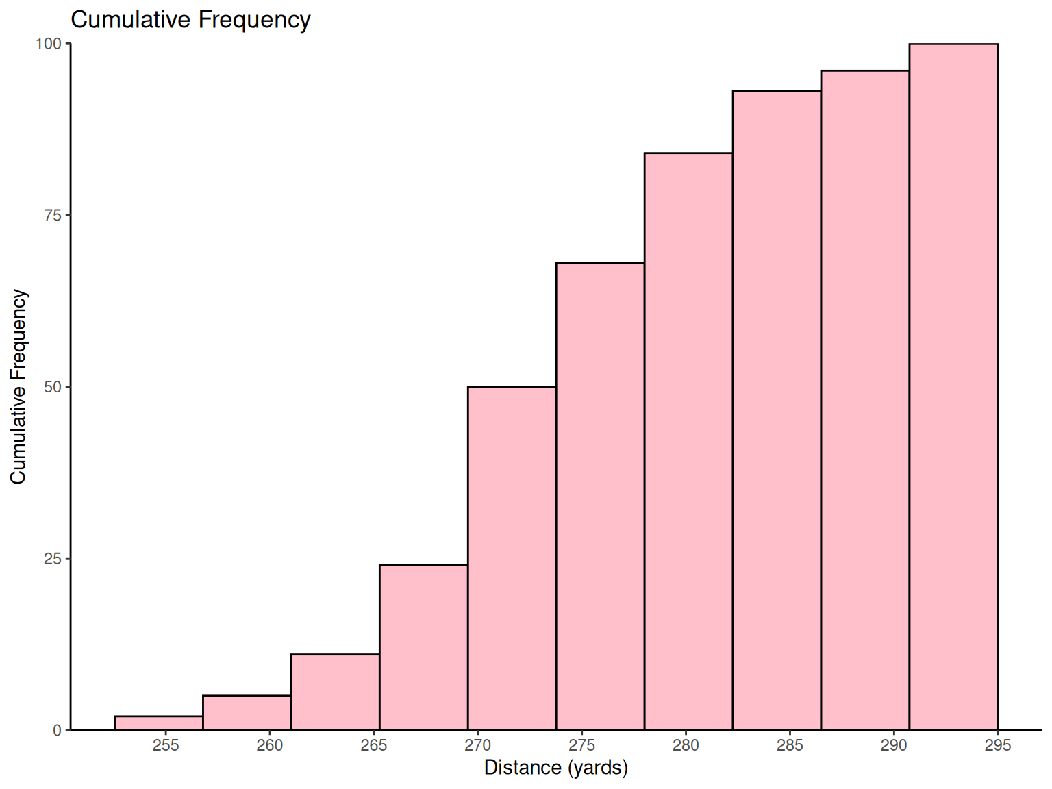
1.3 Histograms
1.3.1 Histogram
NoteHistogram
Engineering Definition: A histogram is a graphical representation of data distribution, showing frequency or relative frequency within specified intervals (bins). Histograms are essential tools for:
Process capability analysis
Quality control monitoring
Design specification validation
Statistical process control
Each bin represents a range of values, and bar height reflects the number (or proportion) of data points in that range.
1.3.2 Example
NoteExample: Golf Ball Distance Testing
Engineering Application: The USGA tests golf balls to ensure conformance to regulations. This standardized testing demonstrates how consistent measurement protocols are essential in engineering quality control.
Testing Protocol: Balls are tested using “Iron Byron,” a mechanical device that eliminates human variability, ensuring reproducible test conditions. This exemplifies the engineering principle of controlling sources of variation.
| 291.5 | 274.4 | 290.2 | 276.4 | 272.0 | 268.7 | 281.6 | 281.6 | 276.3 | 285.9 |
| 269.6 | 266.6 | 283.6 | 269.6 | 277.8 | 287.8 | 267.6 | 292.6 | 273.4 | 284.4 |
| 270.7 | 274.0 | 285.2 | 275.5 | 272.1 | 261.3 | 274.0 | 279.3 | 281.0 | 293.1 |
| 277.5 | 278.0 | 272.5 | 271.7 | 280.8 | 265.6 | 260.1 | 272.5 | 281.3 | 263.0 |
| 279.0 | 267.3 | 283.5 | 271.2 | 268.5 | 277.1 | 266.2 | 266.4 | 271.5 | 280.3 |
| 267.8 | 272.1 | 269.7 | 278.5 | 277.3 | 280.5 | 270.8 | 267.7 | 255.1 | 276.4 |
| 283.7 | 281.7 | 282.2 | 274.1 | 264.5 | 281.0 | 273.2 | 274.4 | 281.6 | 273.7 |
| 271.0 | 271.5 | 289.7 | 271.1 | 256.9 | 274.5 | 286.2 | 273.9 | 268.5 | 262.6 |
| 261.9 | 258.9 | 293.2 | 267.1 | 255.0 | 269.7 | 281.9 | 269.6 | 279.8 | 269.9 |
| 282.6 | 270.0 | 265.2 | 277.7 | 275.5 | 272.2 | 270.0 | 271.0 | 284.3 | 268.4 |
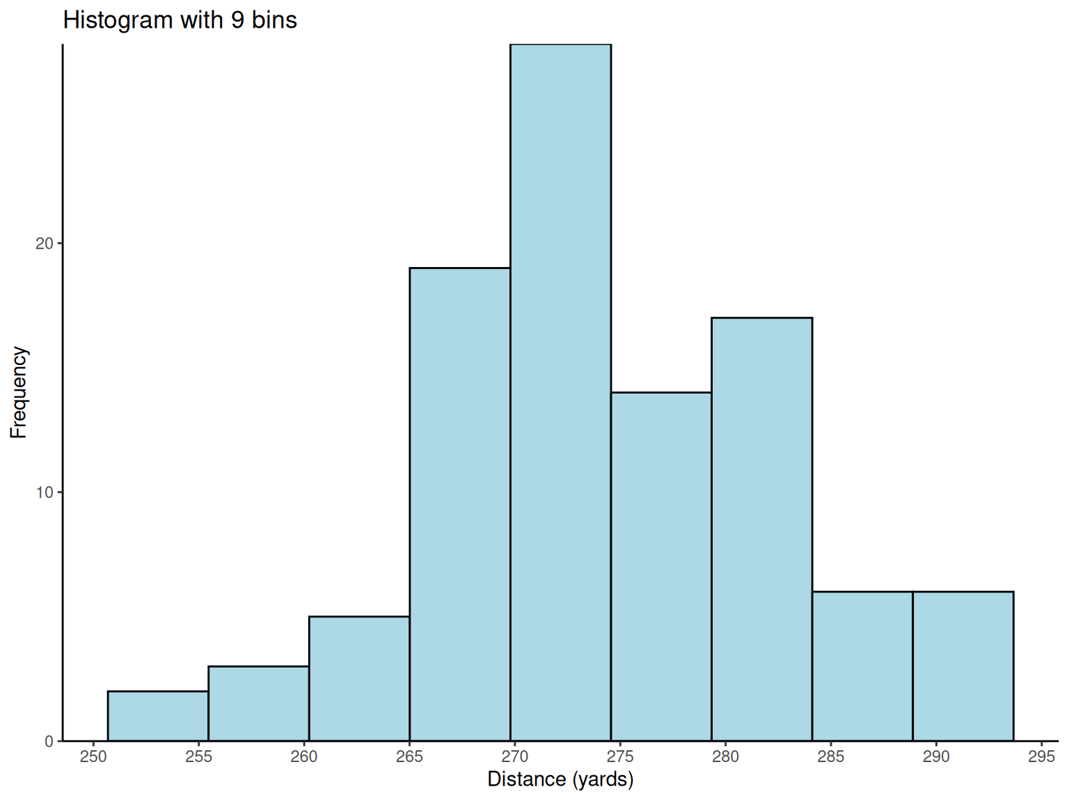
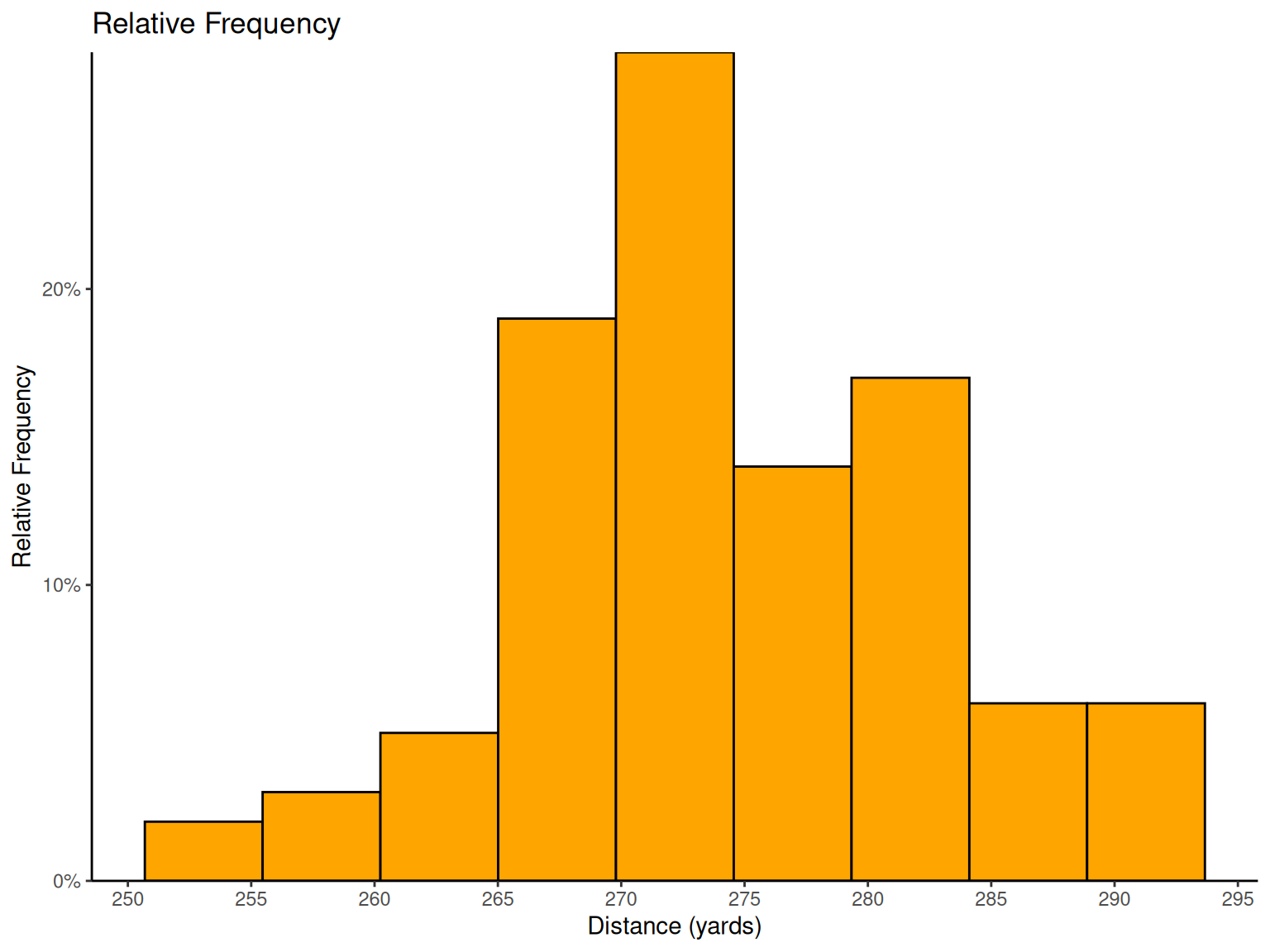
Histogram Design Principles: With 100 observations, \sqrt{100} = 10 suggests about 10 bins for optimal visualization. The analysis reveals important distribution characteristics for engineering decision-making.
Engineering Insights from Histograms:
Distribution Shape: The reasonably symmetric, bell-shaped distribution suggests the manufacturing process is well-controlled
Process Capability: The spread indicates natural process variation
Specification Conformance: Engineers can assess what percentage of balls meet distance requirements

# Golf ball distance histograms
golf_data <- fread("./data/Exmp2.6.csv")

# Basic histogram with 9 bins
p1 <-
  ggplot(golf_data, aes(x = Distance)) +
  geom_histogram(bins = 9, fill = "lightblue", color = "black") +
  scale_x_continuous(breaks = pretty_breaks(n = 8)) +
  scale_y_continuous(expand = c(0, 0), limits = c(0, NA)) +
  labs(x = "Distance (yards)", y = "Frequency", title = "Histogram with 9 bins") +
  theme_classic()

# Histogram with 16 bins
p2 <-
  ggplot(golf_data, aes(x = Distance)) +
  geom_histogram(bins = 16, fill = "lightgreen", color = "black") +
  scale_x_continuous(breaks = pretty_breaks(n = 8)) +
  scale_y_continuous(expand = c(0, 0), limits = c(0, NA)) +
  labs(x = "Distance (yards)", y = "Frequency", title = "Histogram with 16 bins") +
  theme_classic()

# Relative frequency histogram
p3 <-
  ggplot(golf_data, aes(x = Distance)) +
  geom_histogram(aes(y = after_stat(count / sum(count))),
    bins = 9,
    fill = "orange", color = "black"
  ) +
  scale_x_continuous(breaks = pretty_breaks(n = 8)) +
  scale_y_continuous(expand = c(0, 0), limits = c(0, NA), labels = percent_format()) +
  labs(x = "Distance (yards)", y = "Relative Frequency", title = "Relative Frequency") +
  theme_classic()

# Cumulative frequency histogram
p4 <-
  ggplot(golf_data, aes(x = Distance)) +
  geom_histogram(aes(y = after_stat(cumsum(count))),
    bins = 10,
    fill = "pink", color = "black"
  ) +
  scale_x_continuous(breaks = pretty_breaks(n = 8)) +
  scale_y_continuous(expand = c(0, 0), limits = c(0, NA)) +
  labs(x = "Distance (yards)", y = "Cumulative Frequency", title = "Cumulative Frequency") +
  theme_classic()

print(p1)
print(p2)
print(p3)
print(p4)
1.3.3 Pareto Chart
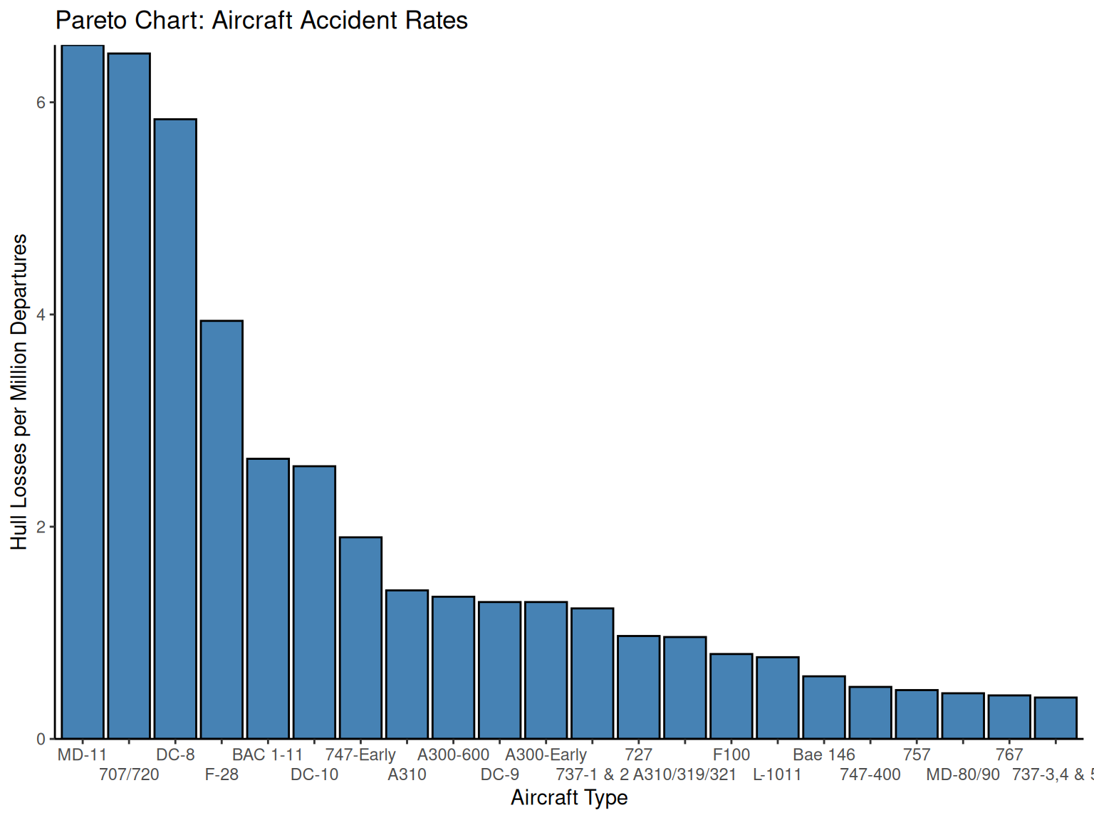
NotePareto Chart
Engineering Application: Pareto charts are fundamental tools in quality engineering and process improvement, embodying the “80-20 rule” or “vital few vs. trivial many” principle. They help engineers prioritize improvement efforts by identifying the most significant causes of problems.
Key Features:
Categories ordered by frequency (highest to lowest)
Focuses attention on major contributors
Guides resource allocation for maximum impact
Essential for root cause analysis
1.3.4 Example
NoteExample: Aircraft Safety Analysis
Engineering Context: This analysis of aircraft accident data demonstrates how Pareto charts help engineers identify critical safety issues and prioritize design improvements.
Data Source: Aircraft accident rates from The Wall Street Journal analysis, showing hull losses per million departures between 1959-1999 for 22 aircraft types.
| Aircraft Type | Actual Number of Hull Losses | Hull Losses/Million Departures |
|---|---|---|
| MD-11 | 5 | 6.54 |
| 707/720 | 115 | 6.46 |
| DC-8 | 71 | 5.84 |
| F-28 | 32 | 3.94 |
| BAC 1-11 | 22 | 2.64 |
| DC-10 | 20 | 2.57 |
| 747-Early | 21 | 1.9 |
Engineering Analysis: The top three aircraft types account for the majority of incidents on a per-million-departures basis. Notably:
707/720 and DC-8: Mid-1950s designs, largely out of service
MD-11: 1990s design with concerning safety record (5 losses out of 198 aircraft)
Process Improvement Insights: This Pareto analysis helps aviation engineers:
Focus safety improvements on high-risk aircraft designs
Understand the relationship between design era and safety performance
Allocate research resources to address the “vital few” risk factors
# Pareto chart for aircraft accident data
aircraft_data <- fread("./data/Exmp2.8.csv")

aircraft_data %>%
  fmutate(Type = factor(Type, levels = Type[order(-HLMD)])) %>%
  ggplot(aes(x = Type, y = HLMD)) +
  geom_col(fill = "steelblue", color = "black") +
  scale_y_continuous(expand = c(0, 0), limits = c(0, NA)) +
  scale_x_discrete(guide = guide_axis(n.dodge = 2)) +
  labs(
    x = "Aircraft Type",
    y = "Hull Losses per Million Departures",
    title = "Pareto Chart: Aircraft Accident Rates"
  ) +
  theme_classic()
1.4 Box Plot
NoteBox Plot
Engineering Applications: Box plots are powerful tools for engineering data analysis, providing comprehensive information about data distribution in a compact visual format.
What Box Plots Reveal:
Measure of Central Tendency (median)
Measure of Variability (IQR, range)
Measure of Symmetry (distribution shape)
Outliers (unusual observations)
Group Comparisons (process/design alternatives)
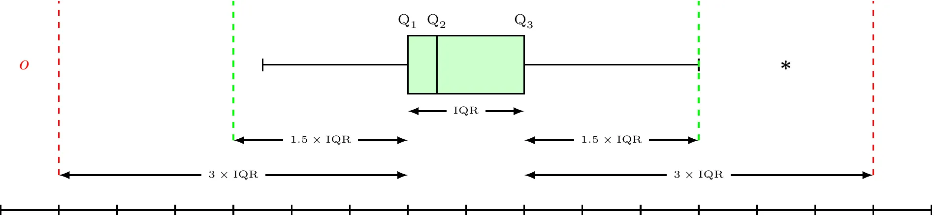 Box Whisker Plot
Statistical Definitions:
\begin{align*} \text{Lower Inner Fence} & =Q_{1}-1.5\times\text{IQR}\\ \text{Upper Inner Fence} & =Q_{3}+1.5\times\text{IQR}\\ \text{Lower Outer Fence} & =Q_{1}-3\times\text{IQR}\\ \text{Upper Outer Fence} & =Q_{3}+3\times\text{IQR} \end{align*}
Outlier Classification:
Mild Outlier: Beyond inner fence (but inside outer fence)
Extreme Outlier: Beyond outer fence
Engineering Interpretation: Whiskers extend to the most extreme values that are not outliers, helping engineers identify unusual measurements that may indicate process problems or measurement errors.
| q1 | median | q3 | iqr | lower_fence | upper_fence |
|---|---|---|---|---|---|
| 144.5 | 161.5 | 181 | 36.5 | 89.75 | 235.75 |
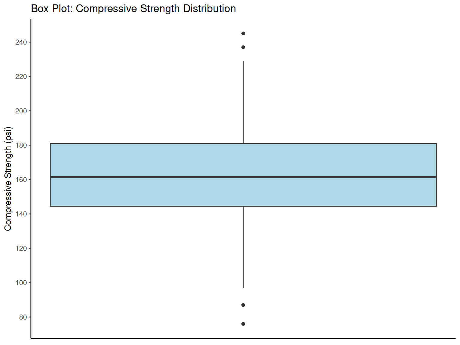
# Box plot for compressive strength data
ggplot(compressive_data, aes(y = CS)) +
  geom_boxplot(width = 0.3, fill = "lightblue") +
  scale_y_continuous(breaks = pretty_breaks(n = 8)) +
  labs(
    y = "Compressive Strength (psi)", x = NULL,
    title = "Box Plot: Compressive Strength Distribution"
  ) +
  theme_classic() +
  theme(axis.ticks.x = element_blank(), axis.text.x = element_blank())

box_stats <- compressive_data %>%
  fsummarise(
    q1 = fquantile(CS, 0.25),
    median = fmedian(CS),
    q3 = fquantile(CS, 0.75),
    iqr = fquantile(CS, 0.75) - fquantile(CS, 0.25),
    lower_fence = fquantile(CS, 0.25) - 1.5 * (fquantile(CS, 0.75) - fquantile(CS, 0.25)),
    upper_fence = fquantile(CS, 0.75) + 1.5 * (fquantile(CS, 0.75) - fquantile(CS, 0.25))
  )

box_stats %>%
  kbl(caption = "Box Plot Statistics", digits = 2) %>%
  kable_styling(bootstrap_options = c("striped", "hover"))
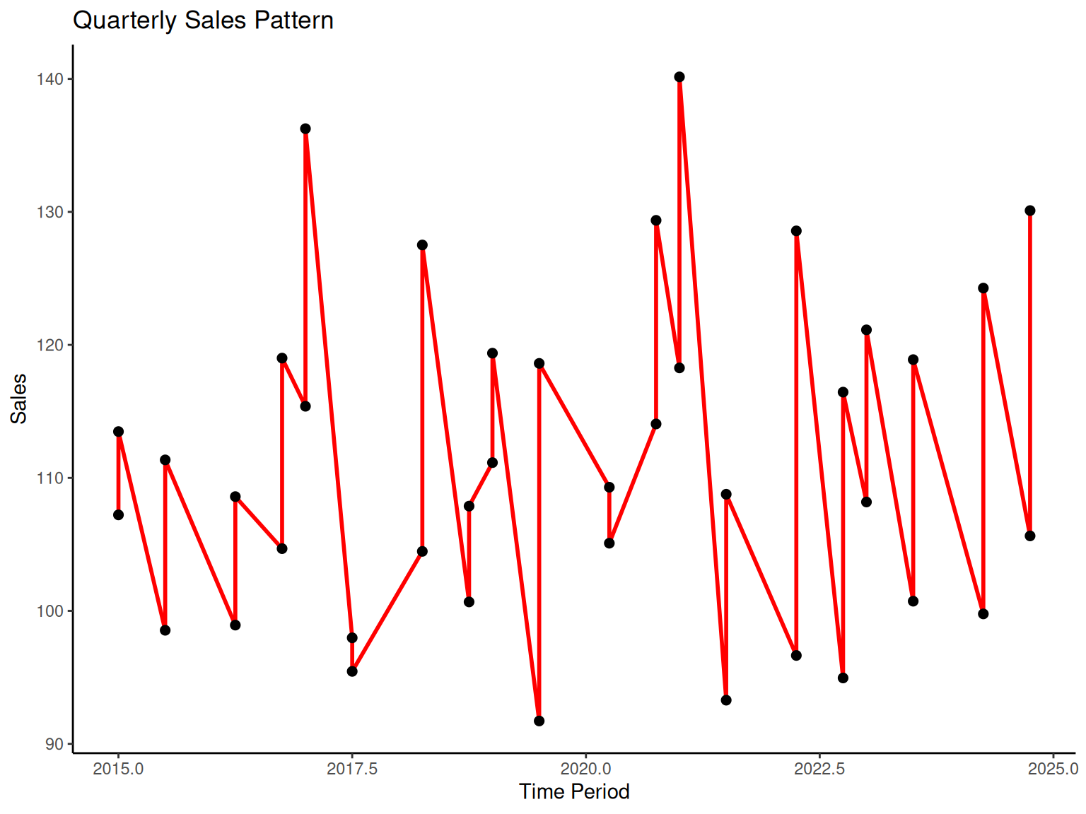
1.5 Time Series Plots
NoteTime Series Plots
Engineering Importance: Time series analysis is critical in engineering for monitoring processes, identifying trends, and predicting future behavior. Understanding temporal patterns helps engineers:
Detect process drift or shifts
Identify cyclical behaviors
Plan maintenance schedules
Optimize production timing
Key Concepts:
Time Series: Data recorded in sequential order over time
Trend: Long-term increase or decrease in values
Cycles: Regular patterns that repeat over time
Seasonality: Predictable patterns related to calendar periods
Engineering Applications:
Equipment performance monitoring
Quality control charts
Production scheduling
Predictive maintenance

# Time series example (simulated company sales data)
set.seed(123)
time_data <-
  data.table(
    year = 2015:2024,
    quarter = rep(1:4, length.out = 40),
    sales = 100 + 0.02 * (1:40)^2 + 10 * sin(2 * pi * (1:40) / 4) + rnorm(40, 0, 5)
  ) %>%
  fmutate(time_period = year + (quarter - 1) / 4)

# Annual sales trend
p5 <-
  time_data %>%
  fgroup_by(year) %>%
  fsummarise(annual_sales = fmean(sales)) %>%
  ggplot(aes(x = year, y = annual_sales)) +
  geom_line(color = "blue", linewidth = 1) +
  geom_point(size = 3) +
  labs(x = "Year", y = "Average Sales", title = "Annual Sales Trend") +
  theme_classic()

# Quarterly sales pattern
p6 <-
  ggplot(time_data, aes(x = time_period, y = sales)) +
  geom_line(color = "red", linewidth = 1) +
  geom_point(size = 2) +
  labs(x = "Time Period", y = "Sales", title = "Quarterly Sales Pattern") +
  theme_classic()

print(p5)
print(p6)

fwrite(time_data, "data/time_series_example.csv")
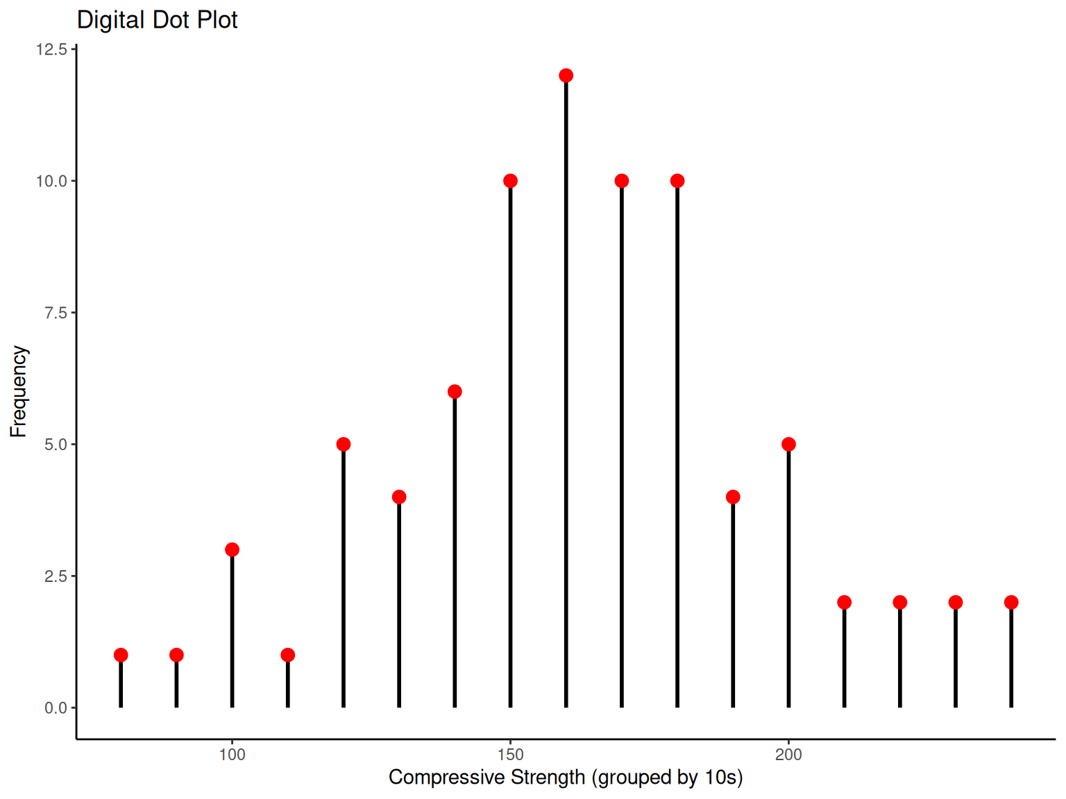
# Digital dot plot
compressive_data %>%
  fmutate(digit = round(CS / 10) * 10, count = 1) %>%
  fgroup_by(digit) %>%
  fsummarise(frequency = fsum(count)) %>%
  ggplot(aes(x = digit, y = frequency)) +
  geom_segment(aes(xend = digit, yend = 0), linewidth = 1) +
  geom_point(size = 3, color = "red") +
  labs(
    x = "Compressive Strength (grouped by 10s)", y = "Frequency",
    title = "Digital Dot Plot"
  ) +
  theme_classic()
1.6 Multivariate Data
NoteMultivariate Data
Engineering Reality: Most engineering problems involve multiple variables simultaneously. Understanding relationships between variables is essential for:
Process optimization
Design improvement
Root cause analysis
Predictive modeling
Key Concepts:
Univariate Analysis: Single variable (mean, variance, distribution)
Multivariate Analysis: Multiple variables and their relationships
Correlation: Strength of linear relationship between variables
Causation vs. Correlation: Important distinction for engineering decisions
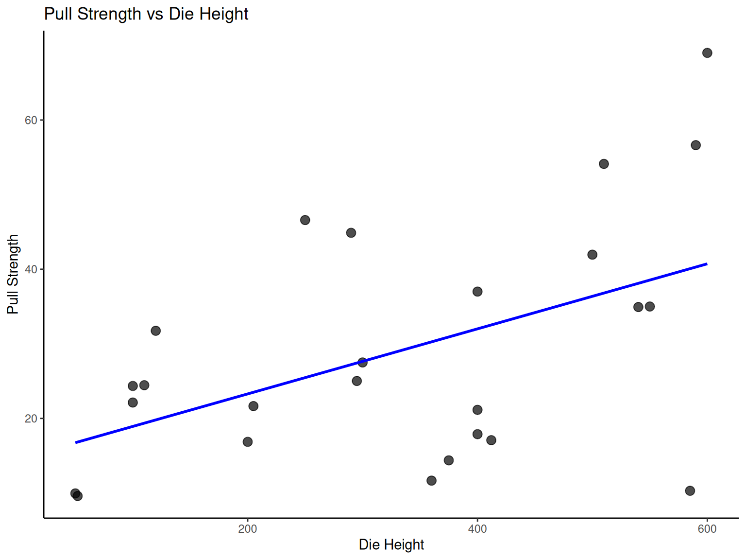
1.6.1 Example
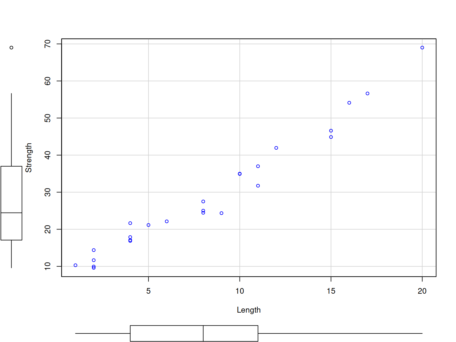
NoteExample: Wire Bond Strength Analysis
Engineering Context: Wire bonding is a critical process in semiconductor manufacturing. Understanding how process parameters affect bond strength is essential for reliable electronic devices.
Process Variables:
Pull Strength (Y): Response variable (quality measure)
Wire Length (X1): Process parameter
Die Height (X2): Design parameter
| Obs No | Pull Strength (Y) | Wire Length (X1) | Die Height (X2) |
|---|---|---|---|
| 1 | 9.95 | 2 | 50 |
| 2 | 24.45 | 8 | 110 |
| 3 | 31.75 | 11 | 120 |
| 4 | 35.00 | 10 | 550 |
| 5 | 25.02 | 8 | 295 |
| 6 | 16.86 | 4 | 200 |
| 7 | 14.38 | 2 | 375 |
| 8 | 9.60 | 2 | 52 |
| 9 | 24.35 | 9 | 100 |
| 10 | 27.50 | 8 | 300 |
| 11 | 17.08 | 4 | 412 |
| 12 | 37.00 | 11 | 400 |
| 13 | 41.95 | 12 | 500 |
| 14 | 11.66 | 2 | 360 |
| 15 | 21.65 | 4 | 205 |
| 16 | 17.89 | 4 | 400 |
| 17 | 69.00 | 20 | 600 |
| 18 | 10.30 | 1 | 585 |
| 19 | 34.93 | 10 | 540 |
| 20 | 46.59 | 15 | 250 |
| 21 | 44.88 | 15 | 290 |
| 22 | 54.12 | 16 | 510 |
| 23 | 56.63 | 17 | 590 |
| 24 | 22.13 | 6 | 100 |
| 25 | 21.15 | 5 | 400 |
Engineering Questions:
Which parameter most strongly affects bond strength?
Are the parameters independent of each other?
Can we predict strength from parameter settings?
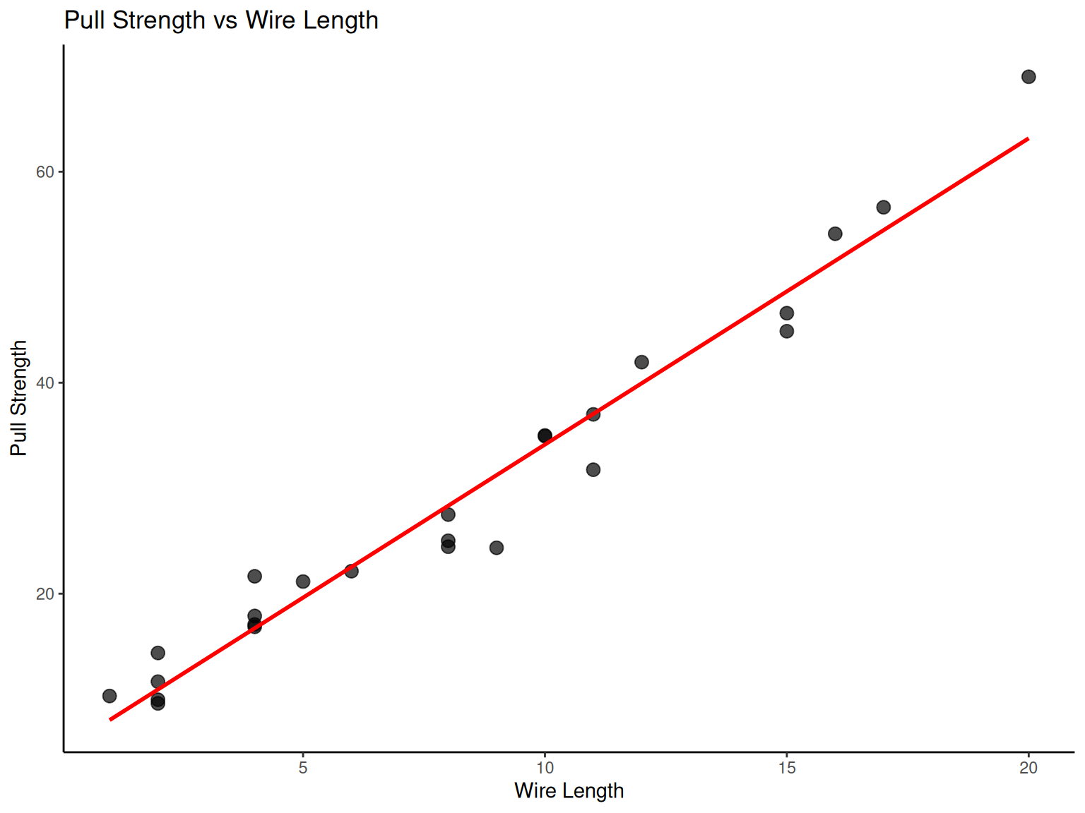

# Wire bond data analysis
wire_data <- fread("./data/Table2.9.csv")

# Scatter plot: Pull strength vs Wire length
p7 <-
  ggplot(wire_data, aes(x = X1, y = Y)) +
  geom_point(size = 3, alpha = 0.7) +
  geom_smooth(method = "lm", se = FALSE, color = "red") +
  labs(x = "Wire Length", y = "Pull Strength", title = "Pull Strength vs Wire Length") +
  theme_classic()

# Scatter plot: Pull strength vs Die height
p8 <-
  ggplot(wire_data, aes(x = X2, y = Y)) +
  geom_point(size = 3, alpha = 0.7) +
  geom_smooth(method = "lm", se = FALSE, color = "blue") +
  labs(x = "Die Height", y = "Pull Strength", title = "Pull Strength vs Die Height") +
  theme_classic()

print(p7)
print(p8)

library(car)
scatterplot(
  formula = Y ~ X1,
  data = wire_data,
  smooth = FALSE,
  regLine = FALSE,
  xlab = "Length",
  ylab = "Strength"
)

scatterplot(
  formula = Y ~ X2,
  data = wire_data,
  smooth = FALSE,
  regLine = FALSE,
  xlab = "Die height",
  ylab = "Strength"
)
1.6.2 Sample Correlation Coefficient
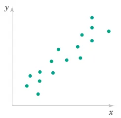
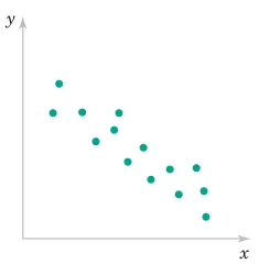
NoteSample Correlation Coefficient
Engineering Definition: The correlation coefficient quantifies the strength and direction of linear relationships between variables, crucial for understanding process interactions.
Given n pairs of data \left(X_{1},Y_{1}\right),\left(X_{2},Y_{2}\right),\ldots,\left(X_{n},Y_{n}\right):
r=\frac{\sum_{i=1}^{n}\left(X_{i}-\overline{X}\right)\left(Y_{i}-\overline{Y}\right)}{\sqrt{\sum_{i=1}^{n}\left(X_{i}-\overline{X}\right)^{2}\sum_{i=1}^{n}\left(Y_{i}-\overline{Y}\right)^{2}}}
where -1\leq r\leq+1.
Engineering Interpretation:
r ≈ +1: Strong positive relationship (as X increases, Y increases)
r ≈ -1: Strong negative relationship (as X increases, Y decreases)
r ≈ 0: Weak linear relationship (may still have nonlinear relationship)
1.6.3 Example
NoteExample: Shampoo Quality Analysis
Engineering Context: This multivariate analysis demonstrates how engineers evaluate product quality across multiple sensory and performance characteristics. Understanding these relationships helps optimize formulations.
Quality Variables:
Foam: Lathering performance
Scent: Fragrance intensity
Color: Visual appeal
Residue: Cleansing effectiveness
Region: Market segment
Quality: Overall consumer rating
| Foam | Scent | Color | Residue | Region | Quality |
|---|---|---|---|---|---|
| 6.3 | 5.3 | 4.8 | 3.1 | 1 | 91 |
| 4.4 | 4.9 | 3.5 | 3.9 | 1 | 87 |
| 3.9 | 5.3 | 4.8 | 4.7 | 1 | 82 |
| 5.1 | 4.2 | 3.1 | 3.6 | 1 | 83 |
| 5.6 | 5.1 | 5.5 | 5.1 | 1 | 83 |
| 4.6 | 4.7 | 5.1 | 4.1 | 1 | 84 |
| 4.8 | 4.8 | 4.8 | 3.3 | 1 | 90 |
| 6.5 | 4.5 | 4.3 | 5.2 | 1 | 84 |
| 8.7 | 4.3 | 3.9 | 2.9 | 1 | 97 |
| 8.3 | 3.9 | 4.7 | 3.9 | 1 | 93 |
| 5.1 | 4.3 | 4.5 | 3.6 | 1 | 82 |
| 3.3 | 5.4 | 4.3 | 3.6 | 1 | 84 |
| 5.9 | 5.7 | 7.2 | 4.1 | 2 | 87 |
| 7.7 | 6.6 | 6.7 | 5.6 | 2 | 80 |
| 7.1 | 4.4 | 5.8 | 4.1 | 2 | 84 |
| 5.5 | 5.6 | 5.6 | 4.4 | 2 | 84 |
| 6.3 | 5.4 | 4.8 | 4.6 | 2 | 82 |
| 4.3 | 5.5 | 5.5 | 4.1 | 2 | 79 |
| 4.6 | 4.1 | 4.3 | 3.1 | 2 | 81 |
| 3.4 | 5.0 | 3.4 | 3.4 | 2 | 83 |
| 6.4 | 5.4 | 6.6 | 4.8 | 2 | 81 |
| 5.5 | 5.3 | 5.3 | 3.8 | 2 | 84 |
| 4.7 | 4.1 | 5.0 | 3.7 | 2 | 83 |
| 4.1 | 4.0 | 4.1 | 4.0 | 2 | 80 |
Engineering Analysis Goals:
Identify which characteristics most influence overall quality
Understand relationships between formulation parameters
Optimize product design for target markets
| Foam | Scent | Color | Residue | Region | Quality | |
|---|---|---|---|---|---|---|
| Foam | 1.000 | 0.002 | 0.328 | 0.193 | -0.032 | 0.512 |
| Scent | 0.002 | 1.000 | 0.599 | 0.500 | 0.278 | -0.252 |
| Color | 0.328 | 0.599 | 1.000 | 0.524 | 0.458 | -0.194 |
| Residue | 0.193 | 0.500 | 0.524 | 1.000 | 0.165 | -0.489 |
| Region | -0.032 | 0.278 | 0.458 | 0.165 | 1.000 | -0.507 |
| Quality | 0.512 | -0.252 | -0.194 | -0.489 | -0.507 | 1.000 |
| Foam_mean | Foam_sd | Foam_min | Foam_max | Scent_mean | Scent_sd | Scent_min | Scent_max | Color_mean | Color_sd | Color_min | Color_max | Residue_mean | Residue_sd | Residue_min | Residue_max | Region_mean | Region_sd | Region_min | Region_max | Quality_mean | Quality_sd | Quality_min | Quality_max |
|---|---|---|---|---|---|---|---|---|---|---|---|---|---|---|---|---|---|---|---|---|---|---|---|
| 5.5 | 1.45 | 3.3 | 8.7 | 4.91 | 0.67 | 3.9 | 6.6 | 4.9 | 1.02 | 3.1 | 7.2 | 4.03 | 0.7 | 2.9 | 5.6 | 1.5 | 0.51 | 1 | 2 | 84.5 | 4.36 | 79 | 97 |
# Shampoo data correlation matrix
shampoo_data <- fread("./data/Table2.11.csv")

cor_matrix <- cor(shampoo_data)
cor_matrix %>%
  round(3) %>%
  kbl(caption = "Shampoo Data Correlation Matrix") %>%
  kable_styling(bootstrap_options = c("striped", "hover"))

shampoo_summary <-
  shampoo_data %>%
  fsummarise(
    across(
      .cols = is.numeric,
      .fns = list(
        mean = fmean,
        sd = fsd,
        min = fmin,
        max = fmax
      )
    )
  )

shampoo_summary %>%
  kbl(caption = "Shampoo Data Summary Statistics", digits = 2) %>%
  kable_styling(bootstrap_options = c("striped", "hover"))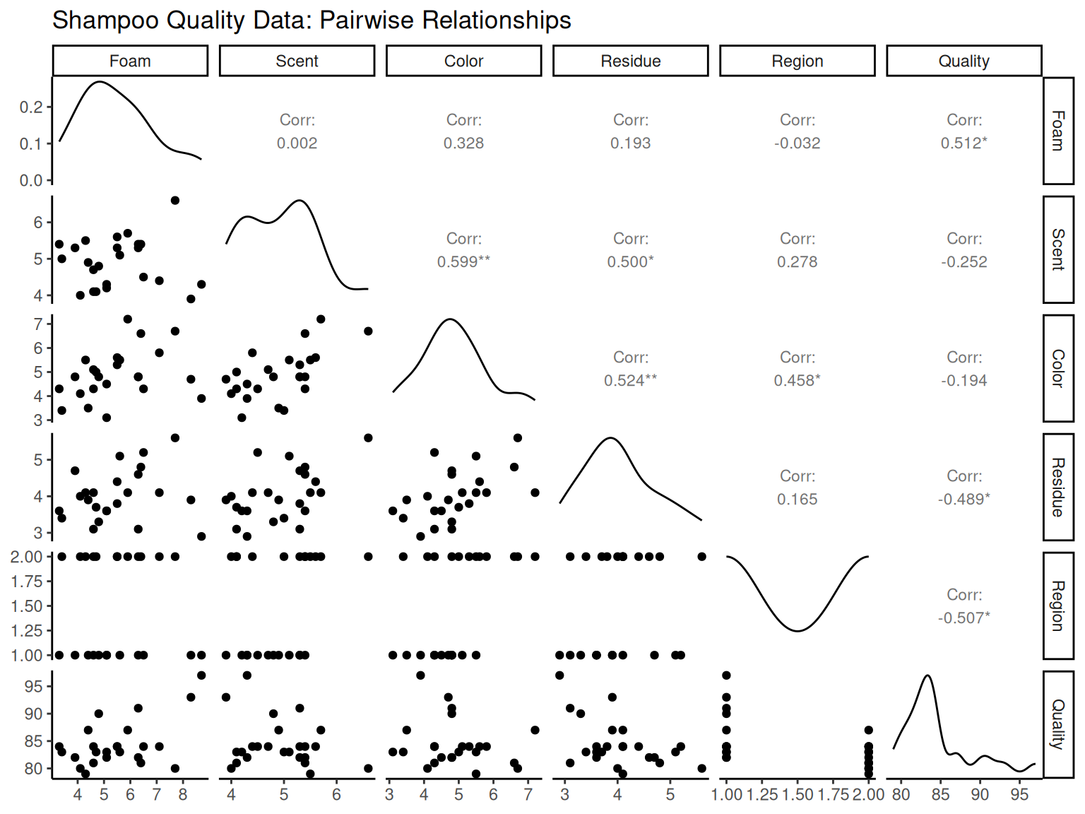
1.7 Key Engineering Takeaways
This chapter provided essential tools for engineering data analysis:
1.7.1 Statistical Foundations
Measures of Central Tendency: Sample mean as balance point for process centering
Measures of Variability: Standard deviation for process control and capability analysis
Distribution Analysis: Understanding natural process variation patterns
1.7.2 Visualization Tools
Histograms: Assess process capability and distribution normality
Box Plots: Identify outliers and compare process alternatives
Stem-and-Leaf: Quick distribution assessment preserving actual values
Pareto Charts: Prioritize improvement efforts using 80-20 principle
1.7.3 Process Analysis
Time Series: Monitor trends, detect shifts, identify cycles
Correlation Analysis: Understand variable relationships for optimization
Multivariate Methods: Analyze complex engineering systems
1.7.4 Engineering Applications
Quality control and process improvement
Design optimization and parameter selection
Root cause analysis and problem solving
Specification setting and capability assessment
These statistical tools form the foundation for evidence-based engineering decisions and continuous improvement initiatives.