Create a publication-quality ggplot2 visualization of Modified HP filter results.
Usage
# S3 method for class 'mhp'
autoplot(object, ...)Details
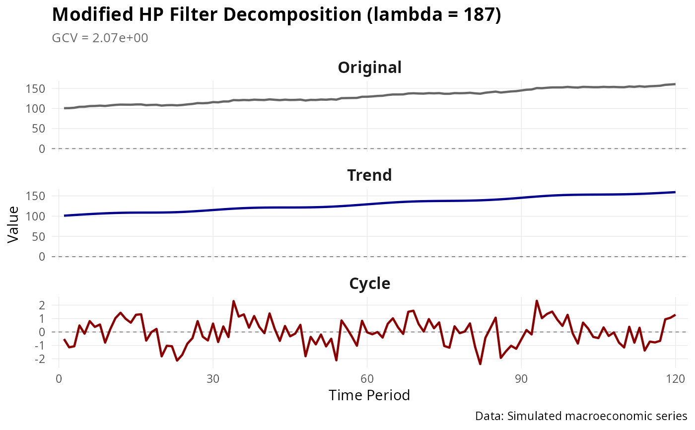
Creates a three-panel plot showing: 1. Original series with trend overlay 2. Trend component 3. Cyclical component
The plot includes optimal lambda and GCV in the title, and uses consistent formatting suitable for publications.
Examples
set.seed(42)
n <- 120
# Create a realistic macroeconomic series
trend <- cumsum(c(0, rnorm(n - 1, mean = 0.5, sd = 0.3)))
cycle <- 3 * sin(2 * pi * (1:n) / 30) + rnorm(n, sd = 0.8)
y <- trend + cycle + 100 # Add level for realism

result <- mhp_filter(y, max_lambda = 10000, as_dt = FALSE)

if (require(ggplot2)) {
  # Basic plot
  autoplot(result)

  # Customized plot
  p <- autoplot(result)
  p <- p +
    ggplot2::theme(
      plot.title = ggplot2::element_text(size = 14, face = "bold"),
      strip.text = ggplot2::element_text(size = 12, face = "bold")
    ) +
    ggplot2::labs(caption = "Data: Simulated macroeconomic series")
  print(p)
}
#> Loading required package: ggplot2