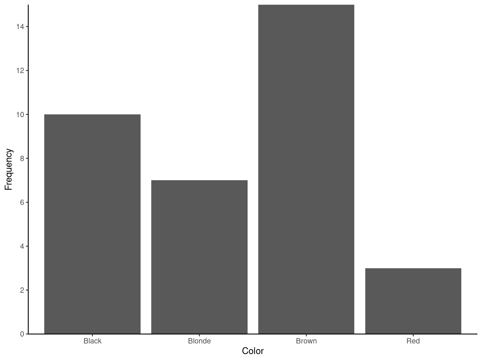
| Color | n | percent |
|---|---|---|
| Black | 10 | 0.2857143 |
| Blonde | 7 | 0.2000000 |
| Brown | 15 | 0.4285714 |
| Red | 3 | 0.0857143 |
| Total | 35 | 1.0000000 |
2 Data Description
2.1 Collecting Data
2.1.1 Observational Study/Survey
Observational Study/Survey
Researcher has no control over conditions of interest.
2.1.2 Experiment
Experiment
Researcher has control over conditions of interest.
2.2 Variable Types
2.2.1 Qualitative Variable
Qualitative Variable
Describe qualities or characteristics.
2.2.2 Quantitative Variable
Quantitative Variable
Represent measurable quantities and are expressed in numerical form.
2.3 Graphical Methods
2.3.1 Qualitative Data
2.3.1.1 Example
Hair Color of 35 Persons
Blonde, Brown, Brown, Black, Red, Brown, Brown, Black, Brown, Brown, Blonde, Black, Brown, Blonde, Black, Red, Brown, Black, Brown, Brown, Brown, Black, Brown, Black, Blonde, Blonde, Black, Brown, Blonde, Black, Brown, Blonde, Red, Black, Brown
library(fastverse)
library(tidyverse)
library(scales)
library(janitor)
library(kableExtra)

Exmp2.1 <-
  data.table(
    Color =
          c(
            "Brown", "Black", "Black", "Brown", "Black", "Blonde", "Brown"
          , "Blonde", "Blonde", "Brown", "Black", "Red", "Brown", "Brown"
          , "Brown", "Brown", "Black", "Brown", "Brown", "Brown", "Brown"
          , "Black", "Red", "Blonde", "Blonde", "Black", "Black", "Brown"
          , "Blonde", "Brown", "Red", "Black", "Blonde", "Brown", "Black"
        )
      )

Exmp2.1 %>%
  tabyl(Color) %>%
  adorn_totals() %>%
  kbl()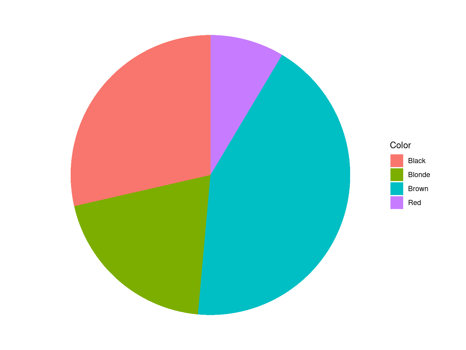
Exmp2.1 %>%
  tabyl(Color) %>%
  ggplot(data = ., aes(x = "", y = n, fill = Color)) +
  geom_bar(stat = "identity", width = 1) +
  coord_polar("y", start = 0) +
  theme_void()

ggplot(data = Exmp2.1, mapping = aes(x = Color)) +
  geom_bar() +
  scale_y_continuous(expand = c(0, 0), limits = c(0, NA), breaks = pretty_breaks(n = 8)) +
  labs(
    x = "Color"
  , y = "Frequency"
  ) +
  theme_classic()
2.3.2 Quantitative Data
2.3.2.1 Example
Monthly sales of small business in $1,000.
8.2, 11.5, 12.1, 7.3, 14.8, 9.4, 9.7, 8.4, 10.1, 12.3, 10.2, 9.5, 13.4, 9.8, 10.9, 15.1, 8.3, 6.1, 8.7, 10.3
| LL | n | percent |
|---|---|---|
| [6.1,8] | 2 | 0.10 |
| (8,10] | 8 | 0.40 |
| (10,12] | 5 | 0.25 |
| (12,14] | 3 | 0.15 |
| (14,16] | 2 | 0.10 |
| Total | 20 | 1.00 |
Exmp2.2 <-
  data.table(
    Sales = c(
                8.2, 11.5, 12.1, 7.3, 14.8, 9.4, 9.7, 8.4, 10.1, 12.3
              , 10.2, 9.5, 13.4, 9.8, 10.9,15.1, 8.3, 6.1, 8.7, 10.3
              )
  )

Exmp2.2 %>%
  fmutate(LL = cut(
                     x = Sales
                   , breaks = c(6.1, 8.0, 10.0, 12.0, 14.0, 16.0)
                   , include.lowest = TRUE
                   , right = TRUE
                   )
          ) %>%
  tabyl(LL) %>%
  adorn_totals() %>%
  kbl()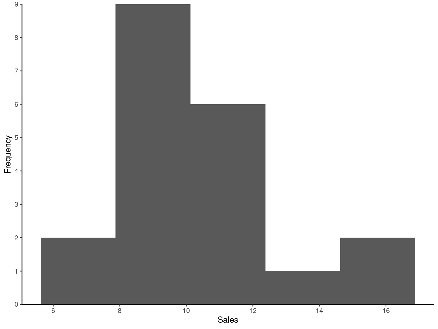
ggplot(data = Exmp2.2, mapping = aes(x = Sales)) +
  geom_histogram(bins = 5) +
  scale_x_continuous(breaks = pretty_breaks(n = 8)) +
  scale_y_continuous(expand = c(0, 0), limits = c(0, NA), breaks = pretty_breaks(n = 8)) +
  labs(
    x = "Sales"
  , y = "Frequency"
  ) +
  theme_classic()
2.3.2.2 Histogram Shapes
Histogram Shapes
- Symmetric
- Uniform
- Skewed Right
- Skewed Left
2.3.2.3 Stem and Leaf Diagram
Stem and Leaf Diagram
- Attempt to capture additional information lost in histogram
- Form stem of first digit (or sometimes multiple digits) of data values
- Attach leaf of trailing digit or digits
2.3.2.4 Example
Monthly sales of small business in $1,000.
8.2, 11.5, 12.1, 7.3, 14.8, 9.4, 9.7, 8.4, 10.1, 12.3, 10.2, 9.5, 13.4, 9.8, 10.9, 15.1, 8.3, 6.1, 8.7, 10.3
  The decimal point is at the |

   6 | 1
   7 | 3
   8 | 2347
   9 | 4578
  10 | 1239
  11 | 5
  12 | 13
  13 | 4
  14 | 8
15 | 1Exmp2.2 %>%
pull(Sales) %>%
stem(x = ., scale = 2, width = 80)2.4 Numerical Methods
2.4.1 Mean
Mean
Consider the random sample:
Y_{1}=6, Y_{2}=11, Y_{3}=5, Y_{4}=7, Y_{5}=4, Y_{6}=9
\begin{align*} \overline{Y} & =\frac{\sum_{i=1}^{n}Y_{i}}{n}=\frac{Y_{1}+Y_{2}+Y_{3}+Y_{4}+Y_{5}+Y_{6}}{6}\\ \overline{Y} & =\frac{6+11+5+7+4+9}{6}=7 \end{align*}
[1] 7Exmp2.3 <- data.table(Y = c(6, 11, 5, 7, 4, 9))
Exmp2.3 %>%
pull(Y) %>%
fmean(x = .)2.4.2 Median
Median
Consider the random sample:
Y_{1}=6, Y_{2}=11, Y_{3}=5, Y_{4}=7, Y_{5}=4, Y_{6}=9
Arrange data in ascending order:
4,5,6,7,9,11
\text{Medain} =\frac{\left(6+7\right)}{2}=6.5
[1] 6.5Exmp2.3 <- data.table(Y = c(6, 11, 5, 7, 4, 9))
Exmp2.3 %>%
pull(Y) %>%
fmedian(x = .)2.4.3 Mean vs Median
Mean vs Median
- Which does one use?
- Consider changing the value of 11 to 110 in previous example data.
- Now Mean is 25.33.
- Median is 6.5.
- Which is more representative of this data?
2.4.4 Outliers
Outliers
- Data values that are far from the majority of the data.
- Median is more resistant to outliers.
- Trimmed Mean: A way to remove the influence of outliers by only averaging the middle \left(100-2k\right)\% of the data \left(k<50\right). A 5% trimmed mean averages the middle 90% of the data.
2.4.5 Percentiles
Percentiles
- The p-th percentile of a population (or sample) is that value within the population (or sample) such that p\% of the population (or sample) is less than or equal to the given value.
- Median
- Quartiles: Q_{1}, Q_{2}, and Q_{3}
- Deciles: D_{1}, D_{2}, \ldots , D_{9}
- Percentiles: P_{1}, P_{2}, \ldots , P_{99}
- Note that, Q_{1}=P_{25}, Q_{2}=D_{5}=P_{50}, and Q_{3}=P_{75}.
[1] 9.95 25% 50% 75%
8.625 9.950 11.650 25% 50% 75%
8.625 9.950 11.650 10% 20% 30% 40% 50% 60% 70% 80% 90%
8.11 8.38 9.19 9.62 9.95 10.24 11.08 12.14 13.54 Exmp2.2 %>%
pull(Sales) %>%
fmedian(x = .)
Exmp2.2 %>%
pull(Sales) %>%
fquantile(x = ., probs = c(0.25, 0.50, 0.75))
Exmp2.2 %>%
pull(Sales) %>%
fquantile(x = ., probs = c(1:3)/4)
Exmp2.2 %>%
pull(Sales) %>%
fquantile(x = ., probs = c(1:9)/10)2.5 Measures of Variability
2.5.1 Range
Range
Consider the random sample:
Y_{1}=6, Y_{2}=11, Y_{3}=5, Y_{4}=7, Y_{5}=4, Y_{6}=9
\begin{align*} \text{Range} & =\text{Largest data value}-\text{Smallest data value}\\ \text{Range} & =11-4=7 \end{align*}
[1] 4 11Exmp2.3 %>%
pull(Y) %>%
frange(x = .)2.5.2 Interquartile Range
Interquartile Range (IQR)
Consider the random sample:
Y_{1}=6, Y_{2}=11, Y_{3}=5, Y_{4}=7, Y_{5}=4, Y_{6}=9
\begin{align*} \text{IQR} & =Q_{3}-Q_{1} \end{align*}
[1] 3.25Exmp2.3 %>%
pull(Y) %>%
IQR(x = .)2.5.3 Variance
Variance
Consider the random sample:
Y_{1}=6, Y_{2}=11, Y_{3}=5, Y_{4}=7, Y_{5}=4, Y_{6}=9
\begin{align*} S^{2} & =\frac{\sum_{i=1}^{n}\left(Y_{i}-\overline{Y}\right)^{2}}{n-1}\\ S^{2} & =\frac{(6-7)^{2}+(11-7)^{2}+(5-7)^{2}+(7-7)^{2}+(4-7)^{2}+(9-7)^{2}}{6-1}\\ S^{2} & =\frac{34}{5}=6.8 \end{align*}
[1] 6.8Exmp2.3 %>%
pull(Y) %>%
fvar(x = .)2.5.4 Standard Deviation
Standard Deviation
Consider the random sample:
Y_{1}=6, Y_{2}=11, Y_{3}=5, Y_{4}=7, Y_{5}=4, Y_{6}=9
\begin{align*} S & =\sqrt{\frac{\sum_{i=1}^{n}\left(Y_{i}-\overline{Y}\right)^{2}}{n-1}}\\ S & =\sqrt{\frac{\sum_{i=1}^{n}Y_{i}^{2}-\frac{\left(\sum_{i=1}^{n}Y_{i}\right)^{2}}{n}}{n-1}}\\ S & =\sqrt{6.8}=2.608 \end{align*}
[1] 2.607681Exmp2.3 %>%
pull(Y) %>%
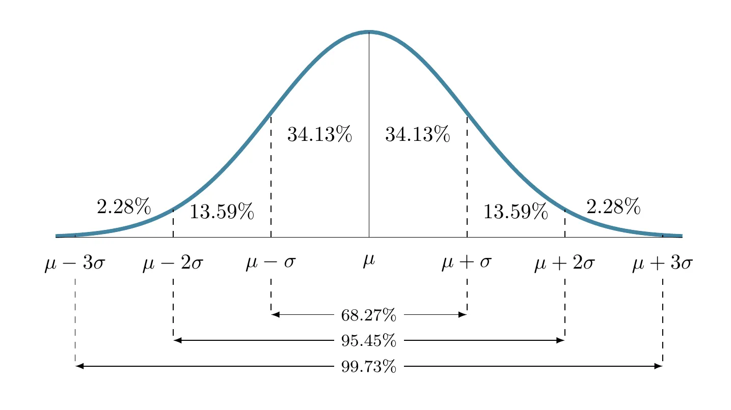
fsd(x = .)2.5.5 Empirical Rule
Empirical Rule
For bell shaped histograms:
2.5.6 Box Plot
Box Plot
Box plot or Box Whisker plot can be used to pick out pertinent aspects of data such as
- Measure of Central Tendency
- Measure of Variability
- Measure of Symmetry
- Outliers
- Group Comparisons
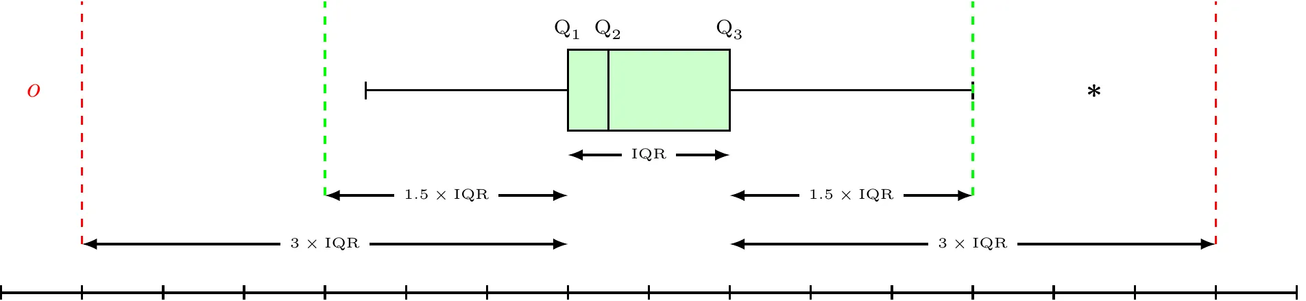
\begin{align*} \text{Lower Inner Fence} & =Q_{1}-1.5\times\text{IQR}\\ \text{Upper Inner Fence} & =Q_{3}+1.5\times\text{IQR}\\ \text{Lower Outer Fence} & =Q_{1}-3\times\text{IQR}\\ \text{Upper Outer Fence} & =Q_{3}+3\times\text{IQR} \end{align*}
- Mild Outlier: Beyond inner fence (but inside outer fence)
- Extreme Outlier: Beyond outer fence
- Note that the lines from the boxes extend to the lower and upper adjacent values (the smallest and largest values that are not outliers).
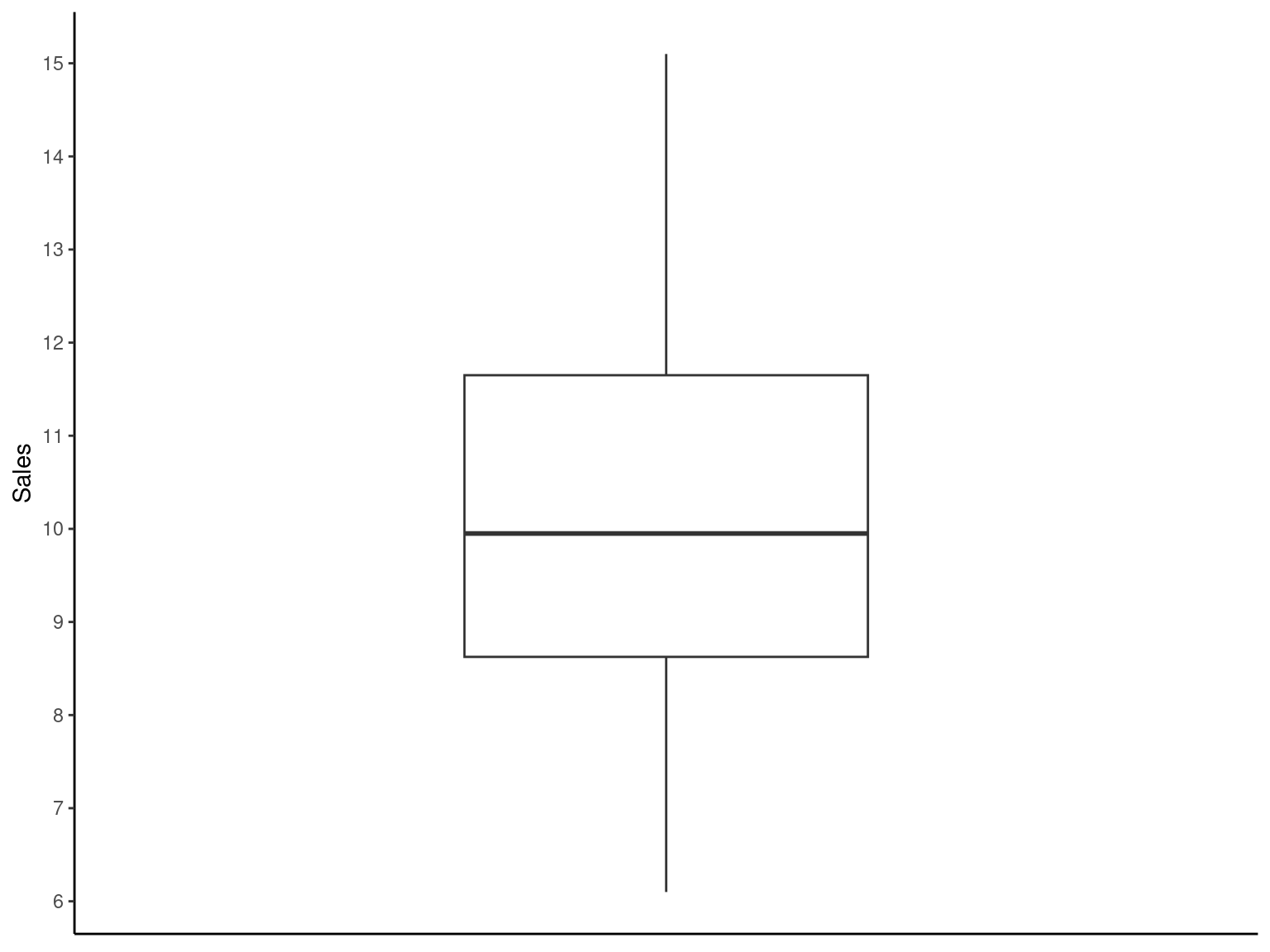
ggplot(data = Exmp2.2, mapping = aes(y = Sales)) +
  geom_boxplot() +
  scale_x_continuous(limits = c(-1, 1)) +
  scale_y_continuous(breaks = pretty_breaks(n = 8)) +
  labs(
    x = NULL
  , y = "Sales"
  ) +
  theme_classic() +
  theme(
    axis.ticks.x = element_blank()
  , axis.text.x  = element_blank()
  )